5 Black Friday Email Marketing Examples Just Before You Finalize Yours
Sreyashi Chatterjee
September 27, 2024
Our previous article on Black Friday email marketing listed the steps and best practices for starting your Black Friday and Cyber Monday preparations. Here are a few examples to inspire you and give you the final nudge and comfort.
Without further ado, let’s get started.
Example 1: Massive prize draw along with a massive offer from True Grit
True Grit Texture Supply is a digital art business selling digital texturing tools for Procreate, Photoshop, Illustrator, Clip Studio Paint, and Affinity. Check out their EDM- they’ve definitely used their own tools to make some great design effects!
We’re fans of anyone dogfooding, and True Grit’s done this in style throughout the design
The offer. One could set up a whole professional design studio with their prize draw! And everyone who buys gets into the draw. No one’s left out. The prize is clearly communicated upfront, followed by a massive BFCM discount of up to 70%. No fuss, no complicated terms & conditions, and free entry into the grand prize draw.
A very clear sign-off with the reminder that the Offer ends in a day
📈What can be improved?
While the email design uses original designs with their own tools, the text isn’t very readable. There’s even a note at the end suggesting switching off night mode if the writing isn’t legible. Maybe more contrasting, bold colors could have helped.
PS: With ZEPIC, you have built-in email templates that you can edit without needing expert designer help.
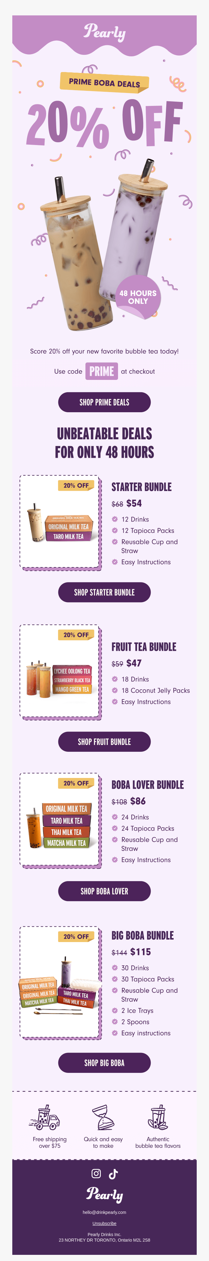
Example 2: Options galore and on-point branding from Pearly Drinks
Here’s Pearly Drinks refreshing and bubbly EDM- almost giving you a feel of what it’d be like actually having one of their delicious bubble teas.
The email design is vibrant and eye-catching, with perfect placement of branding elements like fonts, colors, and structure that really make it pop! We are a fan.
The offers are communicated brilliantly with vibrant pictures and clear names of the different boba teas, along with their discounted prices. The individual CTAs for each product are a huge bonus, making it easy and enticing to purchase!
A brief value proposition at the end with a surprise free shipping offer for over $75 (a literally sweet upgrade for anyone eyeing the lower priced bundles!)
📈What can be improved?
While the email does an exceptional job in terms of design and communicating the offers, a little more detail on the product to encourage volume buying could be helpful eg calorie count. Also, why a flat 20% off across all volumes? The higher volumes usually have higher discounts!
Example 3: Teepublic’s attempt at turning emails into an art canvas
TeePublic is an online marketplace where indie artists sell their designs on customizable products, from tees to home decor, while the platform handles printing and shipping. We totally stan a business supporting budding and independent artists!
TeePublic's retro vibe is on full display here, perfectly matching the t-shirt's funky graphic. Their classic quirkiness shines through, hooking us from the start and reeling us in to reading every last detail of this email. It's a masterclass in staying true to brand while nailing design.
We absolutely love how interactive the email is—it lets you go right into the search without having to leave your inbox!
There’s plenty of social proof, with glowing ratings and easy-to-spot social profile CTAs, making it very comforting and credible for the buyer.
📈What can be improved?
TeePublic's hitting it out of the park with this email. But a little more product info wouldn't hurt, you know? And that "40% OFF" bubble? It's cool, but where does it apply? Linking it clearly could turn more browsers into buyers. These are just our two cents on an already solid pitch.
Example 4: Lonely Planet’s passport to savings
Lonely Planet is a leading travel guide publisher that provides expert recommendations, tips, and inspiration to help travelers explore destinations around the world. And talk about perfect timing—they've dropped this email right when wallets are loose and shopping fever's high. Smart move to tempt travelers with deals when the cash is ready to flow.
The email nails it with its bold key offer: 30% off on everything, using the discount code ‘BLACKFRIDAY’—these value propositions are front and center, loud and clear, leaving no room for confusion!
We like how the email highlights top-sellers and new launches with a clear, organized layout. The mix of images, CTAs, and consistent branding makes it both engaging and on-point.
The fine print's as clear as a Caribbean sea(just look at their Bahamas listing), and they've cranked up the FOMO factor. This deal's got an expiration date(Nov 26) - and it's a one-shot wonder. Miss it, and you'll be kicking yourself all the way to your next adventure.
📈What can be improved?
While the email clearly communicates BFCM offers and discount codes, some trust-building elements might be missing. We did notice the social profiles included at the top, but we think adding customer testimonials or user-generated content—like vacation pictures by travelers, could have added a more authentic and trustworthy touch.
We feel the email is a little one-dimensional. Adding a fun element like holiday trivia could better engage customers. For example, did you know that Japan’s traditional cuisine (washoku) is UNESCO-registered? These tidbits might turn even window shoppers into explorers.
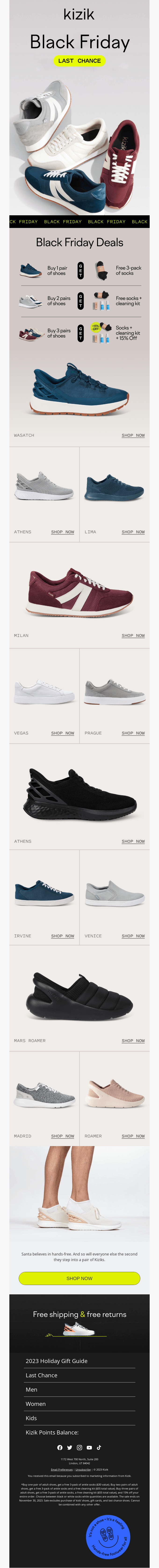
Example 5: Kizik’s “bundle” of joy — Socks, shoes and beyond
Kizik is a footwear brand that offers stylish, slip-on shoes. And honestly, we think that’s pure (lazy) genius. But is their Black Friday email as brilliant as their shoes? Let’s find out!
We love a good product bundle, and pairing their shoes with free socks and a cleaning kit is pure genius. After all, who wouldn’t want fresh socks with new shoes? And it's all free? Now that’s what we call a deal!
The ‘Free shipping and free returns’ offer adds more edge to the already generous offer
The email’s strong visual appeal, featuring high-quality product images of various shoe styles and colors, adds clarity for customers, leaves little room for doubt and encourages quick purchases.
📈What can be improved?
The email design could be a little more responsive, and sorting the products better could make the email much more engaging
We also noticed that this email is a tad lengthier than we’d like to be. In some browsers, this might lead to a clipped version of the email being rendered. To prevent this, Kizik could have personalized the offers by displaying relevant shoes for different customer segments based on their previous purchases/interests—encouraging more clicks and claims. For instance, teens could see offers on sneakers, while customers in their 20s get recommendations for both sneakers and boots.
Speaking of personalization, we want to mention that, with ZEPIC, you can create hyper-personalized audience segments and send relevant emails that are guaranteed to make your customers click, engage and convert.
Conclusion
Feeling that BFCM inspiration spark yet? Now, let's turn that spark into a blaze.
To design similar or even better emails for your Black Friday email campaigns, you should try ZEPIC—our unified customer engagement platform that will empower you to segment customer groups and send hyper-personalized emails that customers can’t ignore.
Desperate times call for desperate Google/Chat GPT searches, right? "Best Shopify apps for sales." "How to increase online sales fast." "AI tools for ecommerce growth."
Been there. Done that. Installed way too many apps. But here's what nobody tells you while you're doom-scrolling through Shopify app reviews at 2 AM—that magical online sales-boosting app you're searching for? It doesn't exist. Because if it did, Jeff Bezos would've bought (or built!) it yesterday, and we (fellow eCommerce store owners) would all be retired in Bali by now. Growing a Shopify store and increasing online sales isn’t easy—we get it. While everyone’s out chasing the next “revolutionary” tool/trend (looking at you, DeepSeek), the real revenue drivers are probably hiding in plain sight—right there inside your customer data. After working with Shopify stores like yours (shoutout to Cybele, who recovered almost 25% of their abandoned carts with WhatsApp automation), we’ve cracked the code on what actually moves the needle. Ready to stop app-hopping and start actually growing your sales by using what you already have? Here are four fixes that will get you there!
The Painful Truth: You're probably losing about 70% of your potential sales to cart abandonment. That's not just a statistic—it's real money walking out of your digital door. And looking for yet another Shopify app for abandoned cart recovery isn't going to fix it if you're not getting the fundamentals right.
The Quick Fix: Everyone knows you need multi-channel recovery that hits the sweet spot between "Hey, did you forget something?" and "PLEASE COME BACK!" But here's the reality—most recovery apps are a one-trick pony. They either do email OR WhatsApp, not both. And don't even get us started on personalizing offers based on cart value—that usually means toggling between three different dashboards while praying your apps talk to each other.
Enter ZEPIC: This is where we come in. With ZEPIC's automated Flows, you can: Launch WhatsApp recovery messages (with 95% open rates!) Set up perfectly timed email sequences (or vice versa) Create personalized recovery offers not just on cart value but based on your customer’s behavior/preferences Track and optimize everything from one dashboard
Fix #2: Reactivate past customers today
The Painful Truth: You're probably losing about 70% of your potential sales to cart abandonment. That's not just a statistic—it's real money walking out of your digital door. And looking for yet another Shopify app for abandoned cart recovery isn't going to fix it if you're not getting the fundamentals right.
The Quick Fix: Everyone knows you need multi-channel recovery that hits the sweet spot between "Hey, did you forget something?" and "PLEASE COME BACK!" But here's the reality—most recovery apps are a one-trick pony. They either do email OR WhatsApp, not both. And don't even get us started on personalizing offers based on cart value—that usually means toggling between three different dashboards while praying your apps talk to each other.
Enter ZEPIC: This is where we come in. With ZEPIC's automated Flows, you can: Launch WhatsApp recovery messages (with 95% open rates!) Set up perfectly timed email sequences (or vice versa) Create personalized recovery offers not just on cart value but based on your customer’s behavior/preferences Track and optimize everything from one dashboard
Offering light at the end of the tunnel is Google’s Privacy Sandbox which seeks to ‘create a thriving web ecosystem that is respectful of users and private by default’. Like the name suggests, your Chrome browser will take the role of a ‘privacy sandbox’ that holds all your data (visits, interests, actions etc) disclosing these to other websites and platforms only with your explicit permission. If not yet, we recommend testing your websites, audience relevance and advertising attribution with Chrome’s trial of the Privacy Sandbox.
Top 3 impacts of the third-party cookie phase-out
Who’s impacted
How
What next
Digital advertising and acquisition teams
Lack of cookie data results in drastic fall in website traffic and conversion rate
Review all cookie-based audience acquisition. Sign up for Chrome’s trial of the Privacy Sandbox
Digital Customer Experience
Customers are not served relevant, personalised experiences: on the web, over social channels and communication media
Multiply efforts to collect first-party customer data. Implement a Customer Data Platform
Security, Privacy and Compliance teams
Increased scrutiny from regulators and questions from customers about data storage and usage
Review current cookie and communication consent management, ensure to align with latest privacy regulations

%201.png)


